this is all the Photoshop and in design work i created to build the skills i needed to create my product,especially in Photoshop where i used the skills i learnt to produce my posters such as feathering images,applying filters, special pasting images into text and liquefying text
Photoshop-assigning text to a shape

I assigned text to a shape by left clicking a shape I made which assigns the text to the shape, I can see where this would be useful, creating logos and such, however I didn't utilize this in my horror poster designs
photoshop: feathering images
I used the select tool and increased the feather to create this feather effect
crtl+shft+i
then delete
I used feathering in my The Greg billboard poster and the effect worked well to blend the character into the surrounding darkness amplifying the effect of the poster.
testing filters on photoshop
I applied different filters to 9 separate photos of cats to change their appearance
1)dry brush
2)cut out
3)diffuse glow
4)dark strokes
5)chalk and charcoal
6)glowing edges
7)accented edges
8)sumi-e
9)ocean ripple
Filters really help bring a piece together and I used them in my ring inspired poster to get the grain textures.
creative text in photoshop
I used the text tool to add text, changed the font and font size and then warped the text by rasterizing layer and free transforming
I used the same skills here to create The Greg posters, I rasterized the text in my posters so I could better manipulate them, like for resizing, creating masks and applying liquify.
picture in text photoshop
to create this image I first added the text and then rasterized it so it became an image, I then used the magic wand holding shift to select all the letters. Once I had done this all I had to do was special paste into an image creating a clipping mask.
I then created a reflection by first grouping both the image and text layer together, and then duplicating the layer, I then flipped image and skewed it using free transform, and finally I used the gradient tool to get a kind of fade effect
I used this in The greg final poster where I put the character into the text, as well as adding filters and gradients.
InDesign first thumbnail
Photoshop liquify
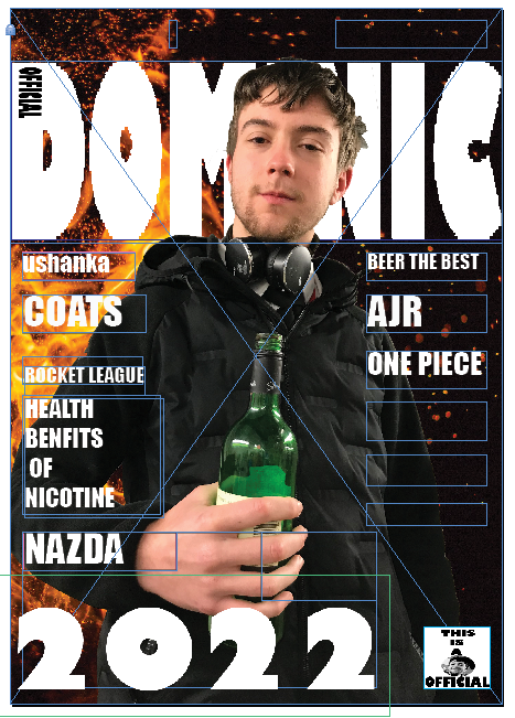
i created a thumbnail for the front page of a magazine using adobe InDesign
Using the liquify tool I warped the text to follow the follow the folds of the flag to create the illusion that's its actually on the flag, to do so I had to rasterize the type first so photoshop would treat the text as an image.
I also changed my brush size when liquefying depending on how big of an area i was trying to warp
If I spent more time i could probably make it better, using blending modes may also helped
I used the liquify tool to create the bleeding text effect in the Greg billboard and its really effective for distorting text in general
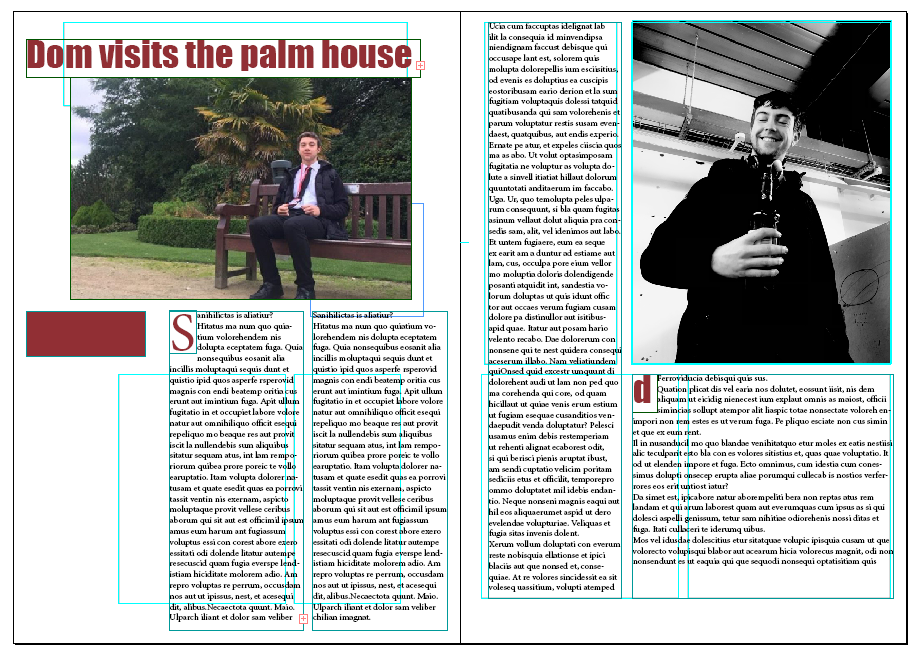
indesign double page spread

indesign film magazine
define pre set brush
unit 20 task 3 Dominic magazine
to create this i first applied the cut out filte3r to the picture to simplify the image, I then added the bob Marley text, selected it with the quick select tool, next I edit-define brush pre-set to create a kind of stamp, after this i used the quick select tool again to select a colour and finally just used the brush pre-set I created to add the text to the selected area
unit 20 task 3 indesign magazine final double page spread
Tomlinson InDesign Task 4
To create this broadsheet front page I used InDesign.
I started by creating by making my page 375 x 597mm,with 6 columns and a centimeter border all round.
I then designed a layout using the rectangle and frame tool so i knew where my text and images would go.
Next I quickly added all the text by creating text boxes and filling them with place holder text.
after this I added the masthead and headlines which was difficult to get exact, I struggled with the sizing and fonts but in the end I think I got something very close, making sure I used a serif font for my masthead and a sans font for my headlines.
once I done all this I added the images, cropping and and resizing them using tools writing InDesign, that being free transform.
on fire text
I created this by creating 3 duplicates of the same text layer and changing the colour of each of them to yellow, orange and red. Once I done this i offset each layer slightly and added gaussian blue to blend it all together, I then grouped the 3 layers and rasterized it.
after this I warped the text with the liquify tool to create the flame effect, when I was happy with this I then duplicated this layer and free transformed to create the reflection, I also added a gradient to make it fade.
to finish I changed the brightness and exposure of the text to make it brighter adding to flame effect.
Added more blur
Tomlinson Indesgin Challenge Task 5
To create this magazine cover I first made a page standard A4 sized(210x297) with 3 columns and a centimetre margin. I then quickly planned out my layout using the rectangle tool and rectangle frame tool. To create the blue fading background I had to go into photoshop and using the gradient tool, and then importing the image into InDesign.To have my main image be covering my masthead partially i had to send the text to the back by going;
object/arrange/send to back
I also had to warp the text, shown by the 'lose your gut' headline, by using the free transform tool.
To create the circle I just used the ellipse tool and filled the colour with the same colour as my strength and numbers, this process was pretty much the same with every shape I added.
ice cold shaun
to create this I did the same method I used to create the on fire Shaun by making 3 text layers, all different colors and slightly offset from each other. I then grouped all the layers into one, rasterized the layer and used liquify to warp the text. After that I used the plastics wrap filter to create the shinning frost effect, I then duplicated the layer and inverted the image to create the reflection, I also added a gradient to make it fade
faces from large brushes
to create these images I created a new layer with a solid colour of black, I then used the eraser tool and selected different brushes with some feather to let the image behind peer through and for it to be blended, I also added some Gaussian blur
special paste into objects for juxtaposition`
to create these images I used the magnetic lasso tool and special paste
to insert images into other images, I applied some filters and overlays to a few images to.
This could of been used to create the The Greg poster with the face peeing through the text however I just cut out a mask with the text pretty much getting the same effect.
morphing 2 images together
to create this image I overlayed the hr Giger image of the image of the cat, matching them eyes and mouth. I then used the lasso tool with 20% feather to merge the 2 images, after this I then used the blur tool to blend it more. Then finally I added poster edge filter.


you are all upto date now on DGs photoshop stuff - well done !!
ReplyDelete